Summarizing Data
Why do we need exploratory analysis and summarizing data
Suppose that you have a information of weights of 1000 students of a school. To understand an anything from it, one way is to going through the data row by row. For e.g. if you want to know what is the lowest weight out of these 1000 weights, you may start comparing very row of data. But, is that prudent? Of course no. Or, if you want to get any insight out of the raw data, is it even possible without exploring it? Of course no. And that is why we need to summarize data and explore it; to find information that can be easily interpreted.
Summarizing Categorical variable
Read about different types of data in this article.
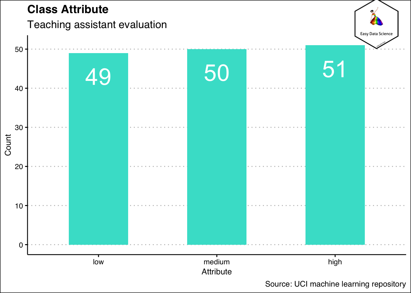
When we have categorical variable, we count. Then we show the result in absolute numbers or in percentage. For e.g. 5 red ball, 2 blue balls and 3 green balls or 50 % red balls, 20 % blue balls and 30 % green balls. We can show the result as a table. Or we can show it as a graph.
 1x<-read.csv("https://query.data.world/s/ycimehoogc3wiwgkd65z7d24v6mqik", header=TRUE, stringsAsFactors=FALSE)
 2
 3names(x)[1]<-"EnglishSpeaker"
 4names(x)[6]<-"ClassAttribute"
 5names(x)[4]<-"Semester"
 6
 7x$EnglishSpeaker<-as.factor(x$EnglishSpeaker)
 8x$Semester<-as.factor(x$Semester)
 9x$ClassAttribute<-as.factor(x$ClassAttribute)
10x<- x %>%
11  mutate(EnglishSpeaker=ifelse(EnglishSpeaker==1,"yes","no"))%>%
12  mutate(ClassAttribute=case_when(ClassAttribute==1 ~ "low",
13                                  ClassAttribute==2 ~ "medium",
14                                  ClassAttribute==3 ~ "high"))%>%
15  mutate(Semester=ifelse(Semester==1, "Summer", "Regular"))%>%
16  select(1,4,6)
17
18
19x%>%
20  group_by(ClassAttribute)%>%
21  summarise(Count=n())%>%
22  mutate(CountPercent=Count/sum(Count))%>%
23  ggplot(aes(y=Count,
24             x = reorder(ClassAttribute,Count),
25             )
26         )+
27  geom_col(width = 0.5,fill='turquoise')+
28  geom_text(aes(y=Count-6, label=Count), color="white", size=10)+
29  labs(title = "Class Attribute",
30       subtitle = "Teaching assistant evaluation",
31       x="Attribute",
32       y="Count",
33       caption = "Source: UCI machine learning repository")+
34  theme_clean() +
35  annotation_custom(l, xmin = 2.7, xmax = 4, ymin = 50, ymax = 63) +
36  coord_cartesian(clip = "off")
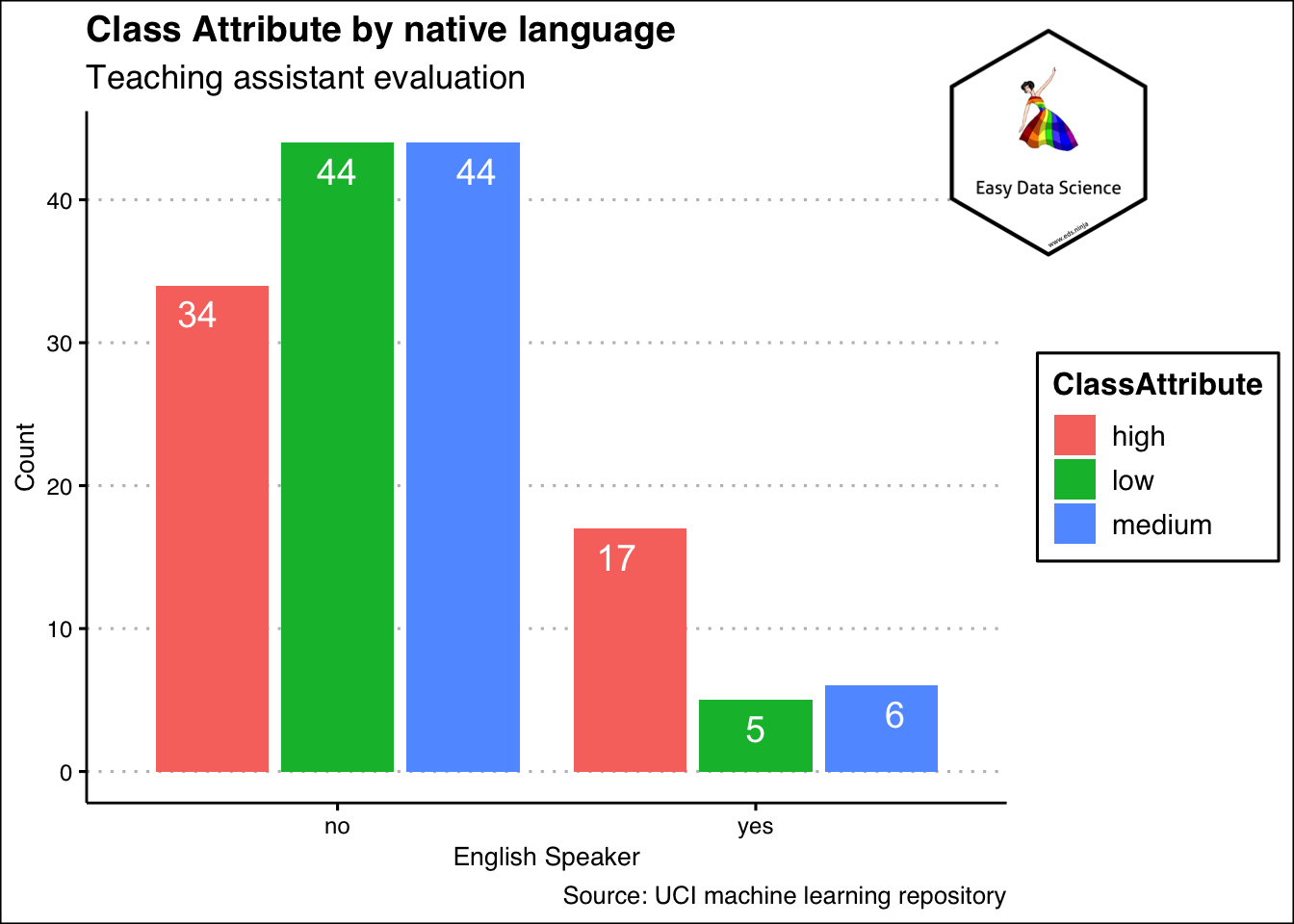
That is the case when we are summarizing one variable. What if there are more than one categorical variable? Then also, we can show as a table, or as a different kind of bar chart as shown below.
 1x%>%
 2  group_by(EnglishSpeaker)%>%
 3  summarise(low=sum(ClassAttribute=="low"), medium=sum(ClassAttribute=="medium"), high=sum(ClassAttribute=="high"))%>%
 4  tidyr::gather("ClassAttribute","Count",-1)%>%
 5  ggplot(aes(x=EnglishSpeaker, y=Count, fill=ClassAttribute))+
 6  geom_col(position="dodge2")+
 7  geom_text(aes(y=Count-2, label=Count),
 8            position = position_dodge(width = 1
 9                                      ),
10            color="white",
11            size=5
12            )+
13  labs(title = "Class Attribute by native language",
14       subtitle = "Teaching assistant evaluation",
15       x="English Speaker",
16       y="Count",
17       caption = "Source: UCI machine learning repository")+
18  theme_clean() +
19  annotation_custom(l, xmin = 2, xmax = 3.4, ymin = 36, ymax = 52) +
20  coord_cartesian(clip = "off")
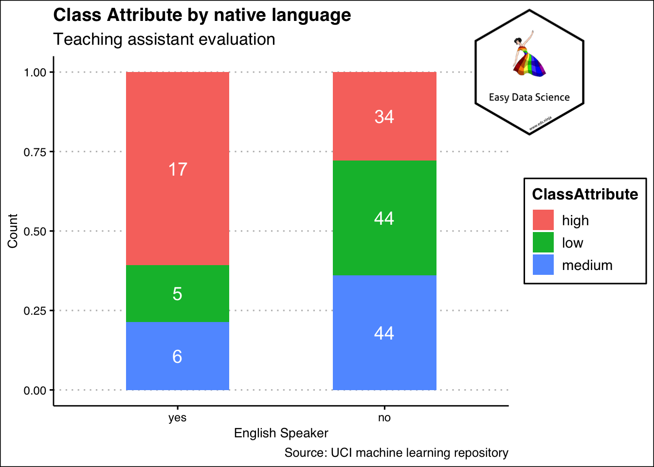
Sometimes, it may be beneficial to show the same data as shown below. Please notice that the y axis has been scaled down to 1 and both yes and no categories add up to one. This means, the colours show the proportion of high, medium and low in each of the yes and no category.
 1x%>%
 2  group_by(EnglishSpeaker)%>%
 3  summarise(low=sum(ClassAttribute=="low"), medium=sum(ClassAttribute=="medium"), high=sum(ClassAttribute=="high"))%>%
 4  tidyr::gather("ClassAttribute","Count",-1)%>%
 5  ggplot(aes(x=reorder(EnglishSpeaker,Count),
 6             y=Count, fill=ClassAttribute))+
 7  geom_col(position="fill", width = 0.5)+
 8  geom_text(aes(label=Count),
 9            position = position_fill(vjust = 0.5),
10            color="white",
11            size=5
12            )+
13  labs(title = "Class Attribute by native language",
14       subtitle = "Teaching assistant evaluation",
15       x="English Speaker",
16       y="Count",
17       caption = "Source: UCI machine learning repository")+
18  theme_clean() +
19  annotation_custom(l, xmin = 2, xmax = 3.4, ymin = 0.8, ymax = 1.2) +
20  coord_cartesian(clip = "off")
In case of categorical variables, we count the number of occurences. If more than one variable is involved, we count the combination of variables.
Summarizing Numeric Variables
Single variable
Like in case of categorical variables, it is also possible to count numeric variables. Usually, the counting is bit different. We create bins and count the bins. For example, if we have weights of 200 individuals that range from 50 kg to 100 kg, we may create bins of 50 kg to 59 kg, 60 kg to 69 kg and so on. These are called bins. And then we show the number of data points that occur in that bin, We can show that in table or as graph.
 1df <- data.frame(
 2  sex=factor(rep(c("F", "M"), each=200)),
 3  weight=round(c(rnorm(200, mean=40, sd=4), rnorm(200, mean=50, sd=5)))
 4  )
 5
 6ggplot(df, aes(x=weight)) +
 7  geom_histogram(binwidth=1, color="black", fill="blue", alpha=0.3)+
 8  labs(title="Histogram of weight",
 9       y="frequency")+
10  theme_clean()+
11  annotation_custom(l, xmin = 60, xmax = 65, ymin = 22, ymax = 30) +
12  coord_cartesian(clip = "off")
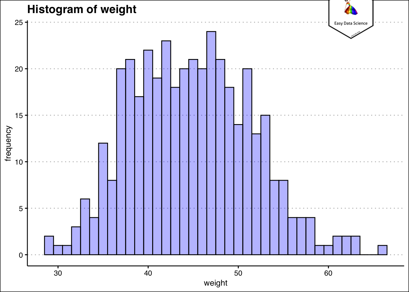
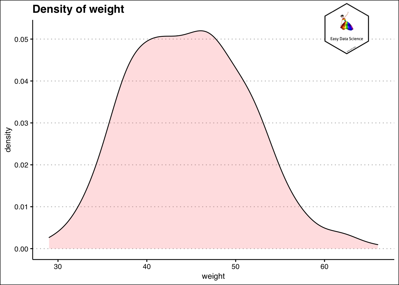
It becomes very easy to understand how much do most of the students weigh, from the histogram. Another way to visualize the information is by using density plot.
1ggplot(df, aes(x=weight)) +
2 geom_density(alpha=.2, fill="#FF6666")+
3  labs(title="Density of weight")+
4  theme_clean()+
5  annotation_custom(l, xmin = 60, xmax = 65, ymin = 0.045, ymax = 0.06) +
6  coord_cartesian(clip = "off")
Another way to summarize single numerical variable is using cumulative frequency. This is done by creating bins of the variable and placing them in order. Then the cumulative occurrences or data points are counted. An example is shown below.
 1df%>%
 2  mutate(weight=case_when(
 3    weight<40 ~ "30-39",
 4    weight>=40 & weight<50 ~ "40-49",
 5    weight>=50 & weight<60 ~ "50-59",
 6    weight>=60  ~ "60-69"
 7  ))%>%
 8  group_by(weight)%>%
 9  summarise(Count=n())%>%
10  mutate(cumulative_count=cumsum(Count))%>%
11  mutate(cumulative_percent=cumulative_count*100/sum(Count)) %>%
12  knitr::kable()
| weight | Count | cumulative_count | cumulative_percent |
|---|---|---|---|
| 30-39 | 95 | 95 | 23.75 |
| 40-49 | 206 | 301 | 75.25 |
| 50-59 | 91 | 392 | 98.00 |
| 60-69 | 8 | 400 | 100.00 |
This is particularly useful while trying to answer questions like "How many are less than or how many are more than certain value".
 1df%>%
 2  mutate(weight=case_when(
 3    weight<40 ~ "30-39",
 4    weight>=40 & weight<50 ~ "40-49",
 5    weight>=50 & weight<60 ~ "50-59",
 6    weight>=60  ~ "60-69"
 7  ))%>%
 8  group_by(weight)%>%
 9  summarise(Count=n())%>%
10  mutate(cumcount=cumsum(Count))%>%
11  mutate(cumper=cumcount*100/sum(Count))%>%
12  ggplot(aes(x=weight, y=cumper, group=1))+geom_line(color="black")+geom_point()+
13  labs(title="Cumulative Percentage of Weight(Range)",
14       x="Weight Ranges",
15       y="Cumulative Percentage (%)")+
16  theme_clean() +
17  annotation_custom(l, xmin = 3, xmax = 4, ymin = 40, ymax = 60) +
18  coord_cartesian(clip = "off")
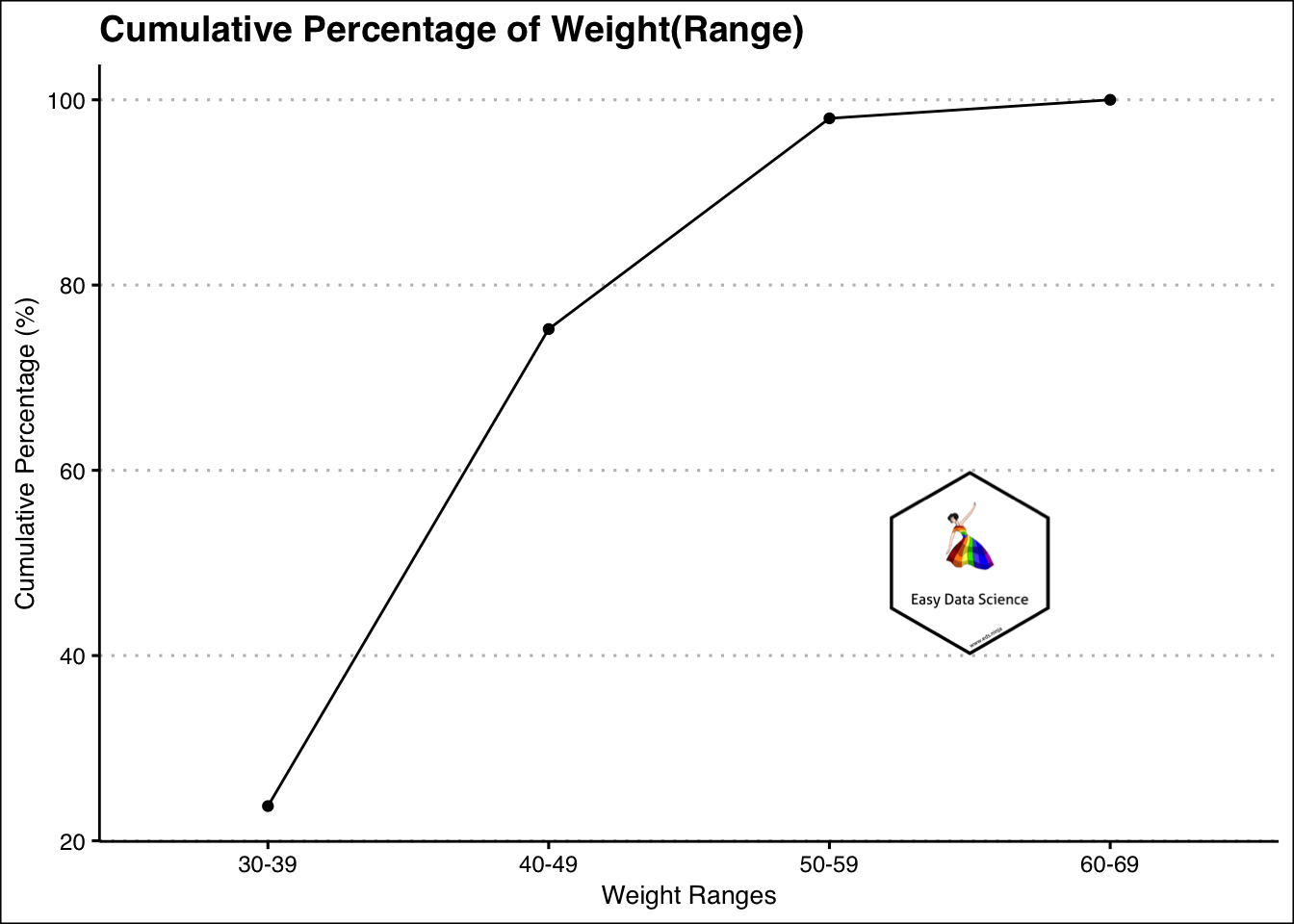
For example, from the above graph, it is evident that most of the weights are less than or equal to 59 kg.
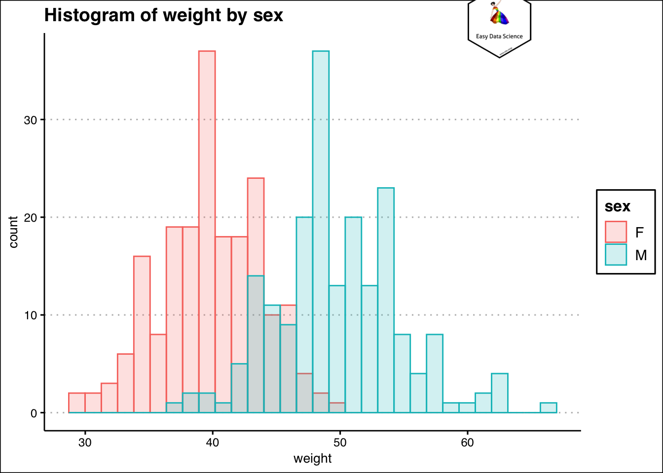
Combination of numeric and categorical variables
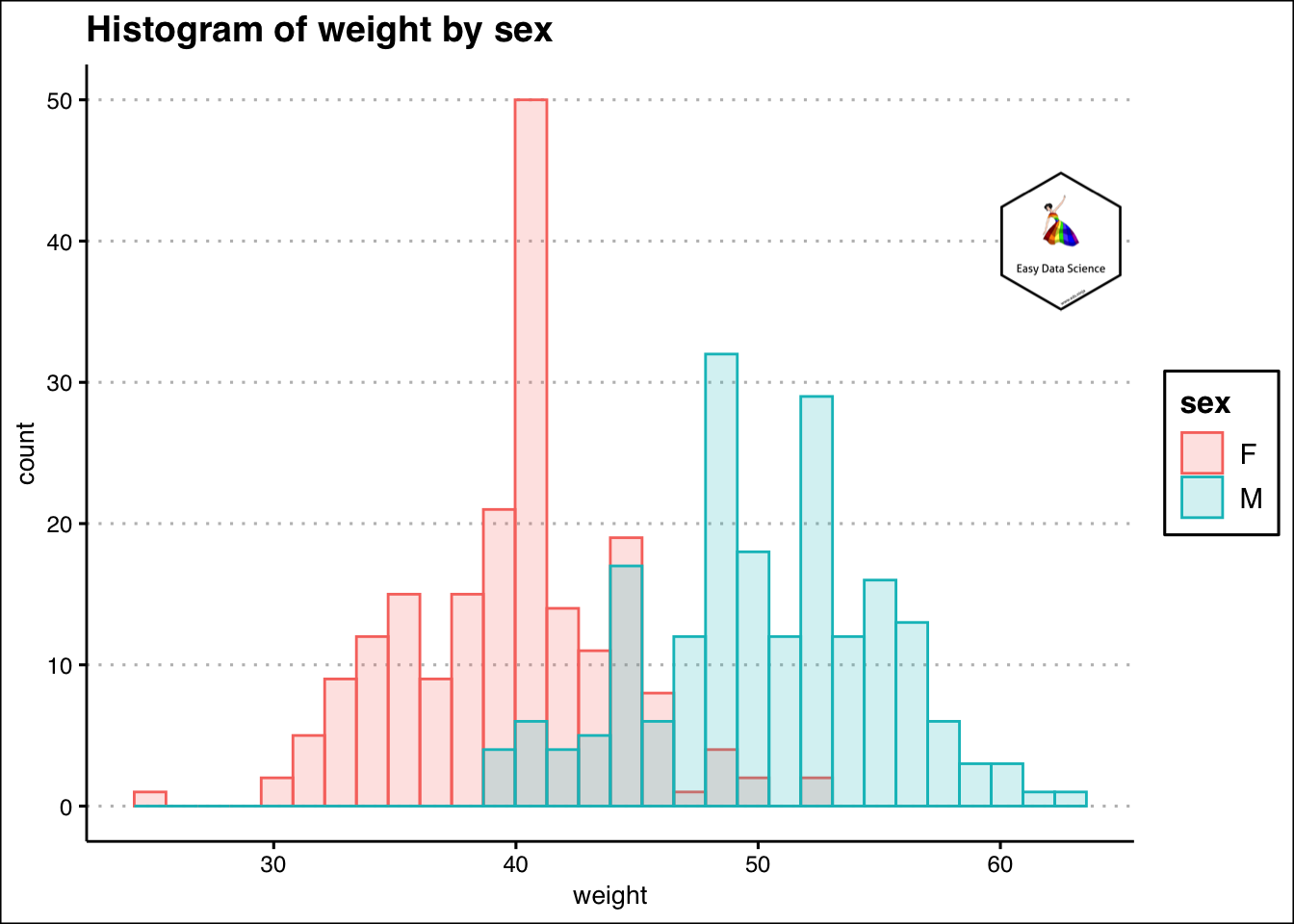
Sometimes we may have combination of numeric and categorical variables. From the previous example, if we want to check the weights of the students by gender, we can plot overlaying histograms.
1ggplot(df, aes(x=weight, color=sex, fill=sex)) +
2  geom_histogram(alpha=0.2, position="identity")+
3  labs(title="Histogram of weight by sex")+
4  theme_clean()+
5  annotation_custom(l, xmin = 60, xmax = 65, ymin = 35, ymax = 45) +
6  coord_cartesian(clip = "off")
1## `stat_bin()` using `bins = 30`. Pick better value with `binwidth`.
Two variables
Whenever two numeric variables are involved, we try to understand the relationship between them.
1mtcars%>%
2  ggplot(aes(x=mpg,y=hp))+geom_point(aes(colour=hp))+
3  labs(x="Fuel consumption (Miles per gallon)",
4       y="Engine power (HP)",
5       title = "Relationship between Engine power and fuel consumption"
6       )+
7  theme_clean()+
8  annotation_custom(l, xmin = 30, xmax = 35, ymin = 275, ymax = 350) +
9  coord_cartesian(clip = "off")
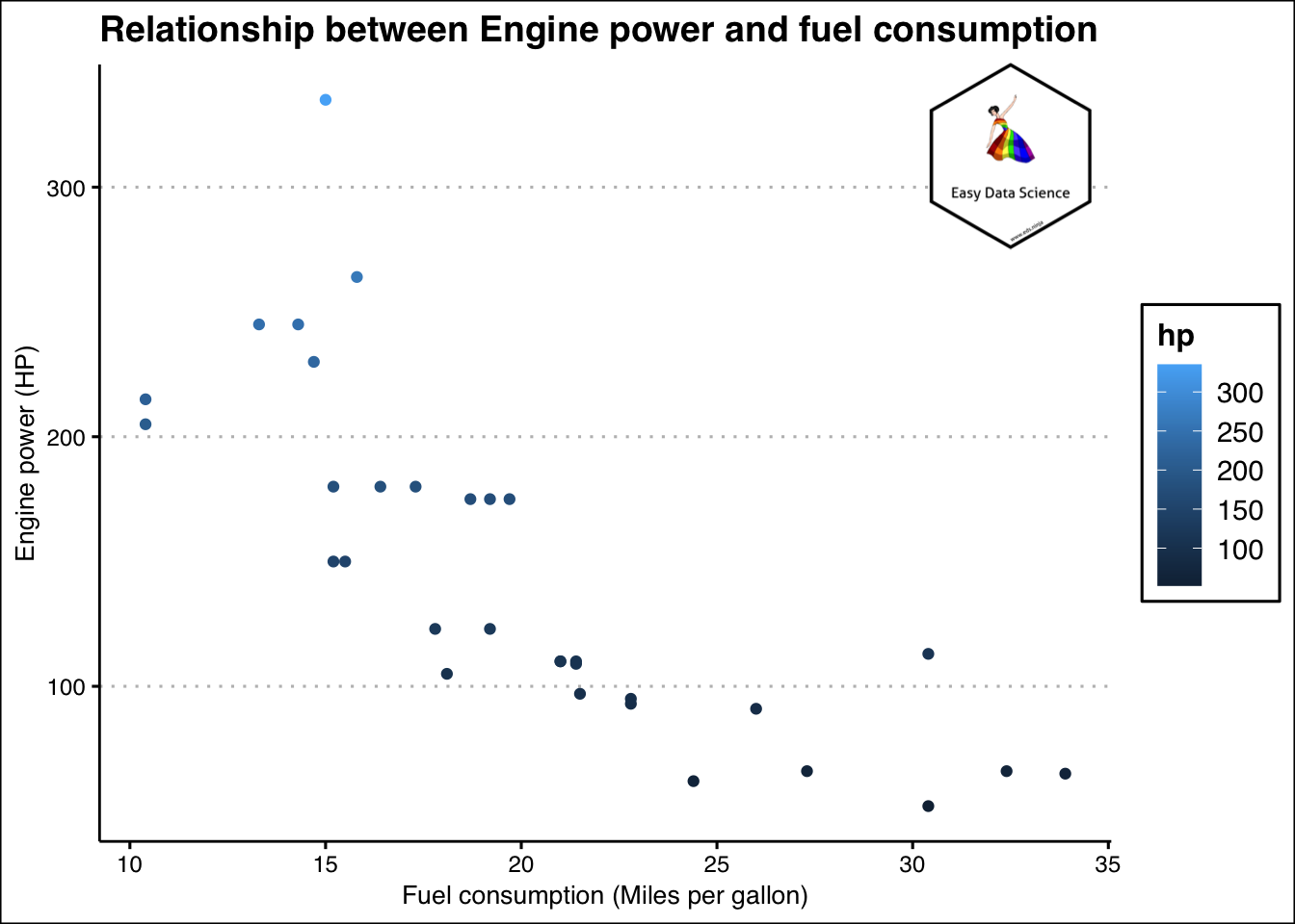
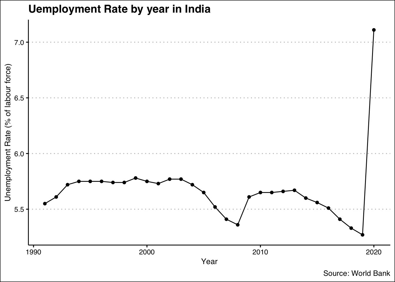
And if one of the variables happen to be a date/year/month/time or similar, we try to understand trend.
1x = WDI(indicator='SL.UEM.TOTL.ZS', country=c('IN'))
2x %>%
3  filter(is.na(x$SL.UEM.TOTL.ZS))
 1##    iso2c country SL.UEM.TOTL.ZS year
 2## 1     IN   India             NA 1990
 3## 2     IN   India             NA 1989
 4## 3     IN   India             NA 1988
 5## 4     IN   India             NA 1987
 6## 5     IN   India             NA 1986
 7## 6     IN   India             NA 1985
 8## 7     IN   India             NA 1984
 9## 8     IN   India             NA 1983
10## 9     IN   India             NA 1982
11## 10    IN   India             NA 1981
12## 11    IN   India             NA 1980
13## 12    IN   India             NA 1979
14## 13    IN   India             NA 1978
15## 14    IN   India             NA 1977
16## 15    IN   India             NA 1976
17## 16    IN   India             NA 1975
18## 17    IN   India             NA 1974
19## 18    IN   India             NA 1973
20## 19    IN   India             NA 1972
21## 20    IN   India             NA 1971
22## 21    IN   India             NA 1970
23## 22    IN   India             NA 1969
24## 23    IN   India             NA 1968
25## 24    IN   India             NA 1967
26## 25    IN   India             NA 1966
27## 26    IN   India             NA 1965
28## 27    IN   India             NA 1964
29## 28    IN   India             NA 1963
30## 29    IN   India             NA 1962
31## 30    IN   India             NA 1961
32## 31    IN   India             NA 1960
 1x<-na.omit(x)
 2x$year<-lubridate::ymd(x$year, truncated = 2L)
 3
 4x%>%
 5  ggplot(aes(x=year, y=SL.UEM.TOTL.ZS))+
 6  geom_line()+
 7  geom_point()+
 8  labs(x="Year",
 9       y="Unemployment Rate (% of labour force)",
10       title = "Uemployment Rate by year in India",
11       caption = "Source: World Bank")+
12  theme_clean() +
13  annotation_custom(l, xmin = 1995, xmax = 2000, ymin = 6.5, ymax = 7.0) +
14  coord_cartesian(clip = "off")
You may want to have a look at the video which explains the above.