डेटा सारांशित करना
मान लीजिए कि आपके पास एक स्कूल के 1000 छात्रों के वजन की जानकारी है। इससे कुछ भी समझने के लिए, एक तरीका यह है कि डेटा के एक एक पंक्ति को पढ़ना । उदाहरण के लिए यदि आप जानना चाहते हैं कि इन 1000 वज़नों में से सबसे कम वज़न क्या है या किसका है , आप एक एक पंक्ति में उपलब्ध वज़न को पढ़ के तुलना शुरू कर सकते हैं । लेकिन, क्या यह समझदारी है? बेशक नहीं। या, यदि आप raw डेटा से कोई अंतर्दृष्टि प्राप्त करना चाहते हैं, तो क्या यह खोजपूर्ण विश्लेषण के बिना संभव है? बेशक नहीं। और इसीलिए हमें डेटा को संक्षेप में प्रस्तुत करने और उसका अन्वेषण करने की आवश्यकता है; आसानी से व्याख्या की जा सकने वाली जानकारी खोजने के लिए।
श्रेणीबद्ध variable का सारांश
डेटा के प्रकारों की जानकारी इस लेख में है |
जब हमारे पास श्रेणीगत variable होता है, तो हम इसे गिनते हैं। फिर हम परिणाम को निरपेक्ष संख्या या प्रतिशत में दिखाते हैं। उदाहरण के लिए 5 लाल गेंद, 2 नीली गेंद और 3 हरी गेंद या 50% लाल गेंद, 20% नीली गेंद और 30% हरी गेंद। हम परिणाम को एक तालिका के रूप में दिखा सकते हैं। या हम इसे एक ग्राफ के रूप में दिखा सकते हैं।
x<-read.csv("https://query.data.world/s/ycimehoogc3wiwgkd65z7d24v6mqik", header=TRUE, stringsAsFactors=FALSE)

names(x)[1]<-"EnglishSpeaker"
names(x)[6]<-"ClassAttribute"
names(x)[4]<-"Semester"

x$EnglishSpeaker<-as.factor(x$EnglishSpeaker)
x$Semester<-as.factor(x$Semester)
x$ClassAttribute<-as.factor(x$ClassAttribute)
x<- x %>%
  mutate(EnglishSpeaker=ifelse(EnglishSpeaker==1,"yes","no"))%>%
  mutate(ClassAttribute=case_when(ClassAttribute==1 ~ "low",
                                  ClassAttribute==2 ~ "medium",
                                  ClassAttribute==3 ~ "high"))%>%
  mutate(Semester=ifelse(Semester==1, "Summer", "Regular"))%>%
  select(1,4,6)


x%>%
  group_by(ClassAttribute)%>%
  summarise(Count=n())%>%
  mutate(CountPercent=Count/sum(Count))%>%
  ggplot(aes(y=Count,
             x = reorder(ClassAttribute,Count),
             )
         )+
  geom_col(width = 0.5,fill='turquoise')+
  geom_text(aes(y=Count-6, label=Count), color="white", size=10)+
  labs(title = "Class Attribute",
       subtitle = "Teaching assistant evaluation",
       x="Attribute",
       y="Count",
       caption = "Source: UCI machine learning repository")+
  theme_clean() +
  annotation_custom(l, xmin = 2.7, xmax = 4, ymin = 50, ymax = 63) +
  coord_cartesian(clip = "off")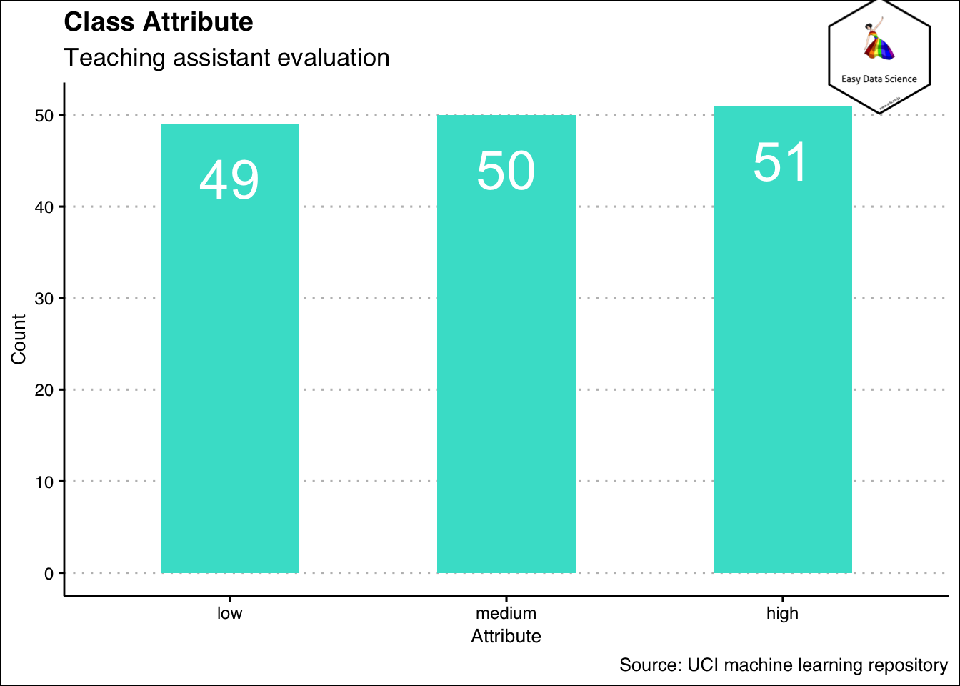
यह तब , जब हम एक वेरिएबल को सारांशित कर रहें हो । एक से अधिक वेरिएबल हो तो क्या करेंगे ? तब भी, हम एक टेबल के रूप में, या नीचे दिखाए गए ग्राफ के अनुसार एक अलग तरह के बार चार्ट के रूप में दिखा सकते हैं।
x%>%
  group_by(EnglishSpeaker)%>%
  summarise(low=sum(ClassAttribute=="low"), medium=sum(ClassAttribute=="medium"), high=sum(ClassAttribute=="high"))%>%
  tidyr::gather("ClassAttribute","Count",-1)%>%
  ggplot(aes(x=EnglishSpeaker, y=Count, fill=ClassAttribute))+
  geom_col(position="dodge2")+
  geom_text(aes(y=Count-2, label=Count),
            position = position_dodge(width = 1
                                      ),
            color="white",
            size=5
            )+
  labs(title = "Class Attribute by native language",
       subtitle = "Teaching assistant evaluation",
       x="English Speaker",
       y="Count",
       caption = "Source: UCI machine learning repository")+
  theme_clean() +
  annotation_custom(l, xmin = 2, xmax = 3.4, ymin = 36, ymax = 52) +
  coord_cartesian(clip = "off")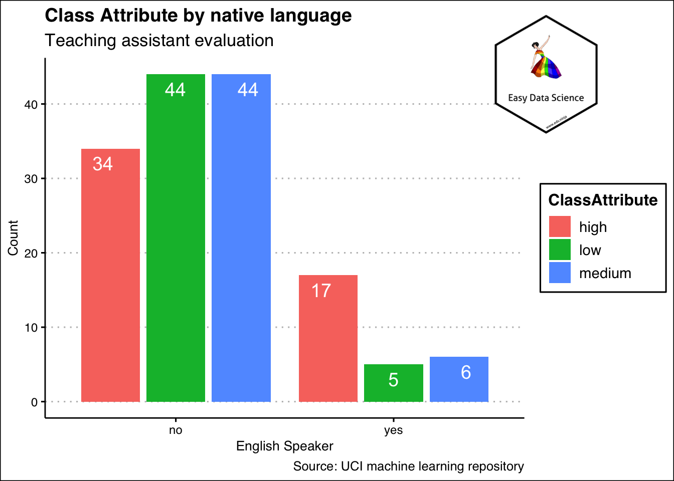
कभी-कभी, इसी डेटा को निचे दिखाए गए ग्राफ के अनुरूप भी दिखाया जा सकता है । कृपया ध्यान दें कि y axis की उच्च सीमा को घटाकर 1 कर दिया गया है और हां और ना दोनों श्रेणियों की उचाई बराबर है । इसका मतलब है, हम इस ग्राफ में कितने हाँ या न है , उसपे ध्यान नहीं देके हाँ या न की अंदर कितने छोटे , बड़े या माध्यम है, उसपे ध्यान दे रहे हैं |
x%>%
  group_by(EnglishSpeaker)%>%
  summarise(low=sum(ClassAttribute=="low"), medium=sum(ClassAttribute=="medium"), high=sum(ClassAttribute=="high"))%>%
  tidyr::gather("ClassAttribute","Count",-1)%>%
  ggplot(aes(x=reorder(EnglishSpeaker,Count),
             y=Count, fill=ClassAttribute))+
  geom_col(position="fill", width = 0.5)+
  geom_text(aes(label=Count),
            position = position_fill(vjust = 0.5),
            color="white",
            size=5
            )+
  labs(title = "Class Attribute by native language",
       subtitle = "Teaching assistant evaluation",
       x="English Speaker",
       y="Count",
       caption = "Source: UCI machine learning repository")+
  theme_clean() +
  annotation_custom(l, xmin = 2, xmax = 3.4, ymin = 0.8, ymax = 1.2) +
  coord_cartesian(clip = "off")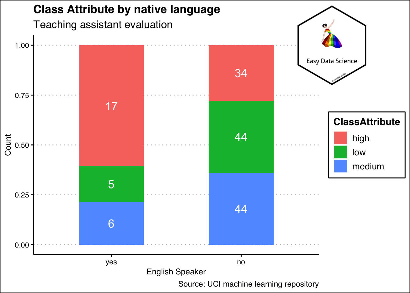
श्रेणीबद्ध वेरिएबल के मामले में, हम घटनाओं की संख्या की गणना करते हैं। यदि एक से अधिक वेरिएबल शामिल हैं, तो हम इनके संयोजन की गणना करते हैं।
संख्यात्मक वेरिएबल का सारांश
एकल वेरिएबल
श्रेणीबद्ध वेरिएबल की तरह, संख्यात्मक वेरिएबल की गणना करना भी संभव है। आमतौर पर, गिनती थोड़ी अलग होती है। हम डिब्बे बनाते हैं और डिब्बे गिनते हैं। उदाहरण के लिए, यदि हमारे पास 200 व्यक्तियों का वजन है जो 50 किग्रा से 100 किग्रा तक है, तो हम 50 किग्रा से 59 किग्रा, 60 किग्रा से 69 किग्रा इत्यादि के डिब्बे बना सकते हैं। इन्हें bins कहा जाता है। और फिर हम उस बिन में होने वाले डेटा बिंदुओं की संख्या दिखाते हैं, हम उसे तालिका में या ग्राफ के रूप में दिखा सकते हैं।
df <- data.frame(
  sex=factor(rep(c("F", "M"), each=200)),
  weight=round(c(rnorm(200, mean=40, sd=4), rnorm(200, mean=50, sd=5)))
  )

ggplot(df, aes(x=weight)) +
  geom_histogram(binwidth=1, color="black", fill="blue", alpha=0.3)+
  labs(title="Histogram of weight",
       y="frequency")+
  theme_clean()+
  annotation_custom(l, xmin = 60, xmax = 65, ymin = 22, ymax = 30) +
  coord_cartesian(clip = "off")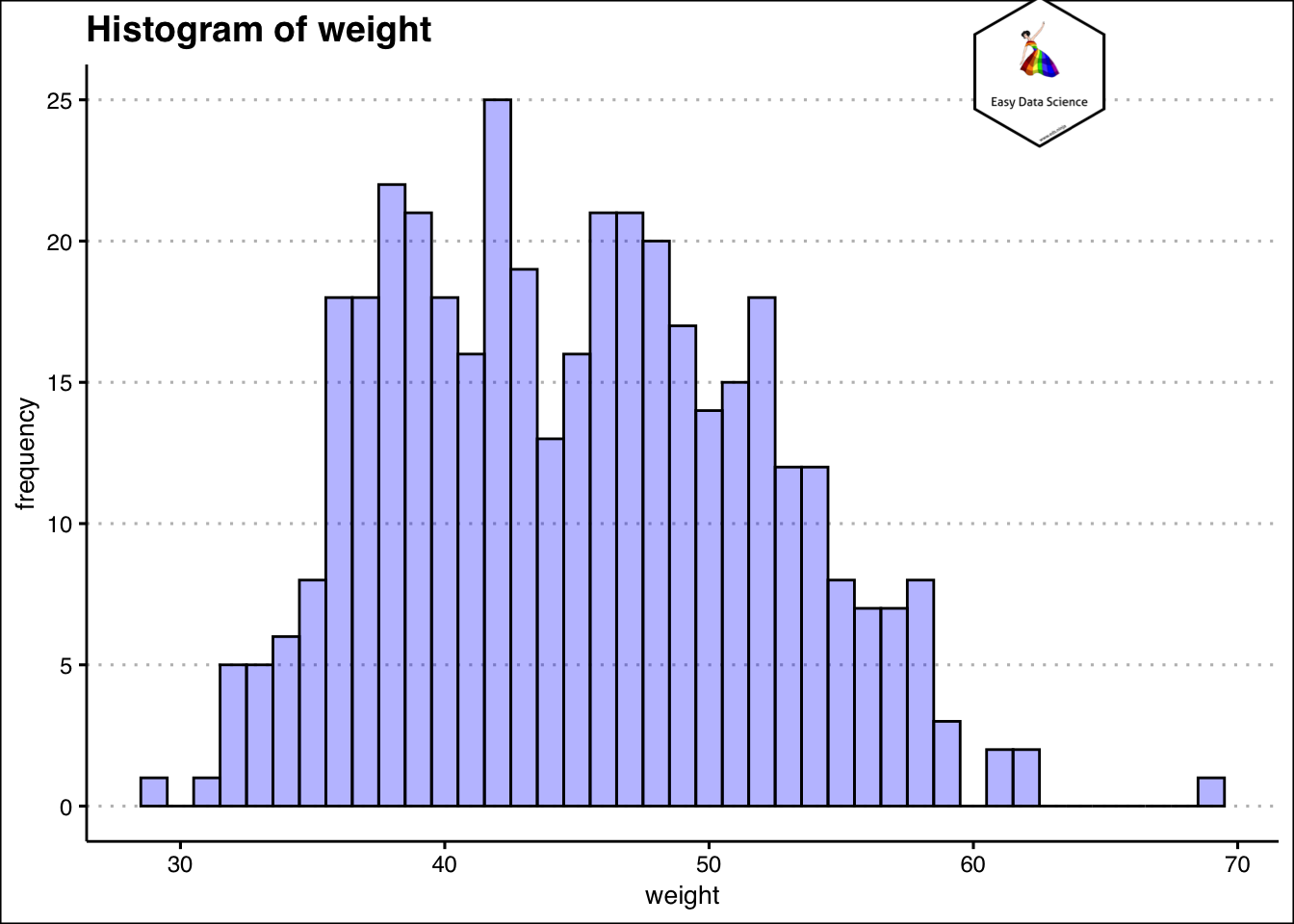
हिस्टोग्राम से यह समझना बहुत आसान हो जाता है कि अधिकांश छात्रों का वज़न लगभग कितना हैं। जानकारी की आकलन करने का दूसरा तरीका घनत्व (density ) प्लॉट का उपयोग करना है।
ggplot(df, aes(x=weight)) +
 geom_density(alpha=.2, fill="#FF6666")+
  labs(title="Density of weight")+
  theme_clean()+
  annotation_custom(l, xmin = 60, xmax = 65, ymin = 0.045, ymax = 0.06) +
  coord_cartesian(clip = "off")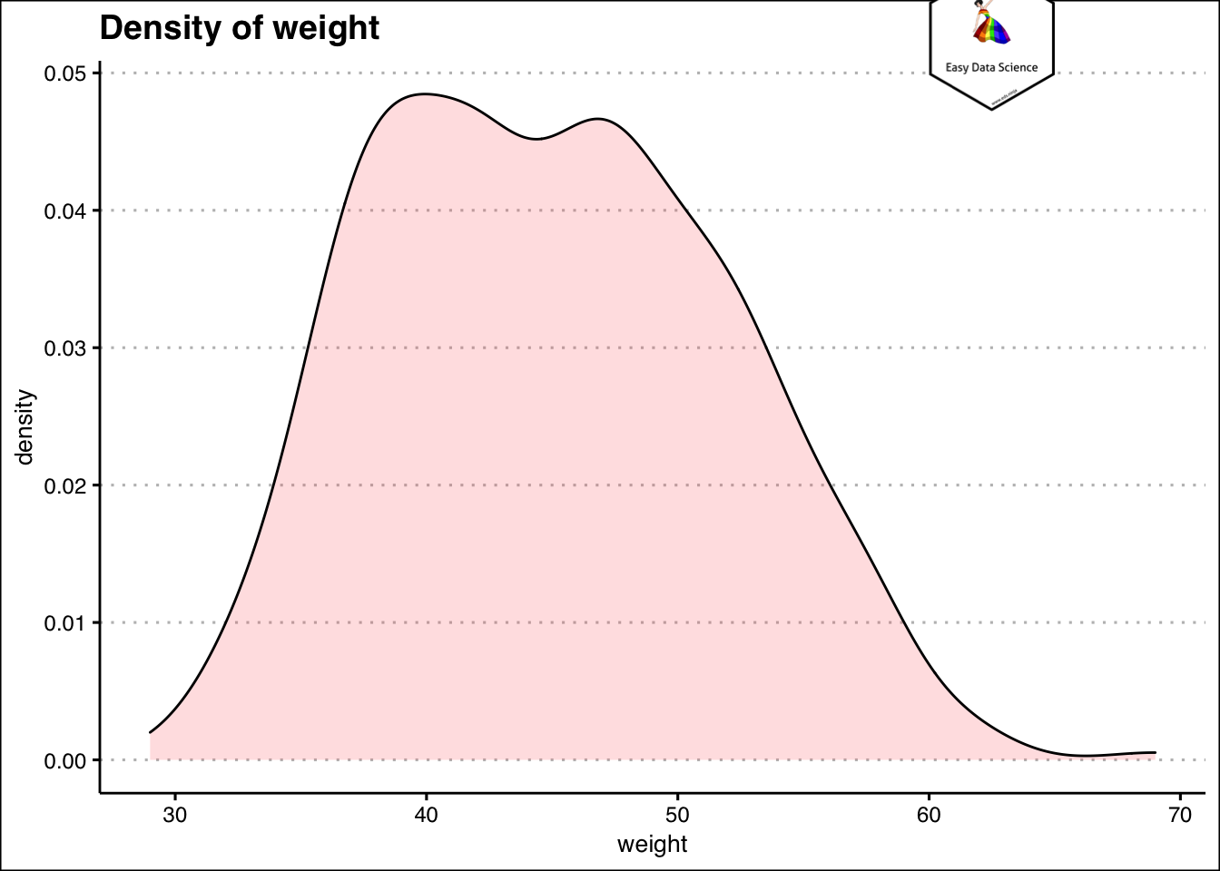
एकल संख्यात्मक वेरिएबल को सारांशित करने का दूसरा तरीका संचयी आवृत्ति (Cumulative frequency ) का उपयोग करना है। यह वेरिएबल के डिब्बे बनाकर और उन्हें क्रम में रखकर किया जाता है। फिर संचयी घटनाओं या डेटा बिंदुओं की गणना की जाती है। एक उदाहरण नीचे दिया गया है।
df%>%
  mutate(weight=case_when(
    weight<40 ~ "30-39",
    weight>=40 & weight<50 ~ "40-49",
    weight>=50 & weight<60 ~ "50-59",
    weight>=60  ~ "60-69"
  ))%>%
  group_by(weight)%>%
  summarise(Count=n())%>%
  mutate(cumulative_count=cumsum(Count))%>%
  mutate(cumulative_percent=cumulative_count*100/sum(Count)) %>%
knitr::kable()| weight | Count | cumulative_count | cumulative_percent |
|---|---|---|---|
| 30-39 | 105 | 105 | 26.25 |
| 40-49 | 186 | 291 | 72.75 |
| 50-59 | 104 | 395 | 98.75 |
| 60-69 | 5 | 400 | 100.00 |
“कितने कम या कितने ज़्यादा” जैसे प्रश्नों के उत्तर देने का प्रयास करते समय यह विशेष रूप से उपयोगी है।
df%>%
  mutate(weight=case_when(
    weight<40 ~ "30-39",
    weight>=40 & weight<50 ~ "40-49",
    weight>=50 & weight<60 ~ "50-59",
    weight>=60  ~ "60-69"
  ))%>%
  group_by(weight)%>%
  summarise(Count=n())%>%
  mutate(cumcount=cumsum(Count))%>%
  mutate(cumper=cumcount*100/sum(Count))%>%
  ggplot(aes(x=weight, y=cumper, group=1))+geom_line(color="black")+geom_point()+
  labs(title="Cumulative Percentage of Weight(Range)",
       x="Weight Ranges",
       y="Cumulative Percentage (%)")+
  theme_clean() +
  annotation_custom(l, xmin = 3, xmax = 4, ymin = 40, ymax = 60) +
  coord_cartesian(clip = "off")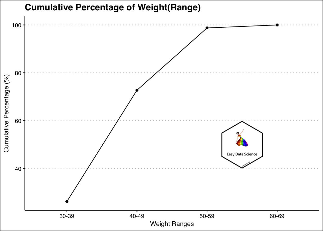
उदाहरण के लिए, उपरोक्त ग्राफ से, यह स्पष्ट है कि अधिकांश वज़न 59 किग्रा से कम या उसके बराबर हैं।
संख्यात्मक और श्रेणीबद्ध वेरिएबल का संयोजन
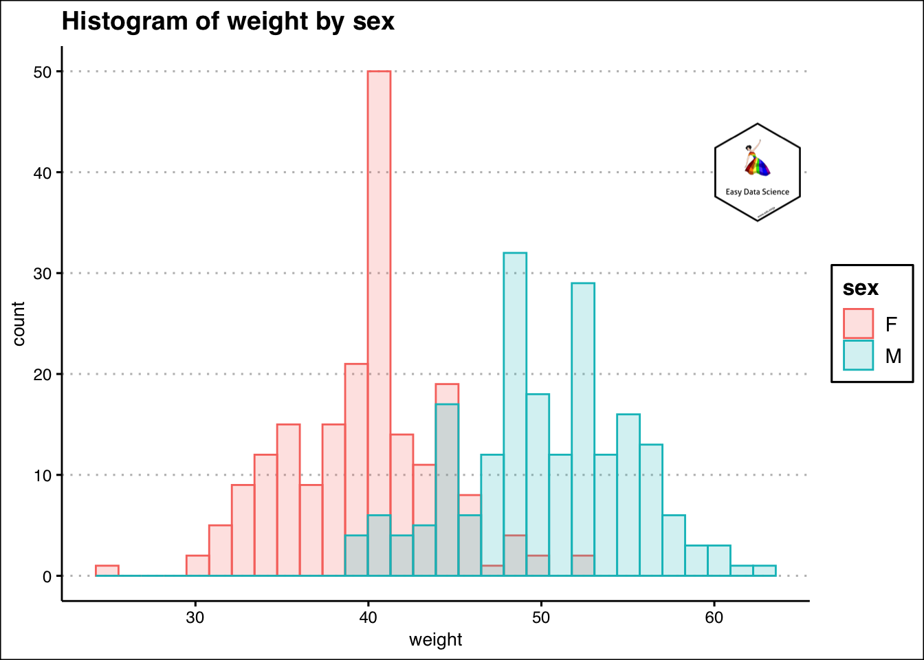
कभी-कभी हमारे पास संख्यात्मक और श्रेणीबद्ध वेरिएबल का संयोजन हो सकता है। पिछले उदाहरण से, यदि हम लिंग के आधार पर छात्रों के वजन की जांच करना चाहते हैं, तो हम ओवरलेइंग (overlaying) हिस्टोग्राम प्लॉट कर सकते हैं।
ggplot(df, aes(x=weight, color=sex, fill=sex)) +
  geom_histogram(alpha=0.2, position="identity")+
  labs(title="Histogram of weight by sex")+
  theme_clean()+
  annotation_custom(l, xmin = 60, xmax = 65, ymin = 35, ymax = 45) +
  coord_cartesian(clip = "off")
## `stat_bin()` using `bins = 30`. Pick better value with `binwidth`.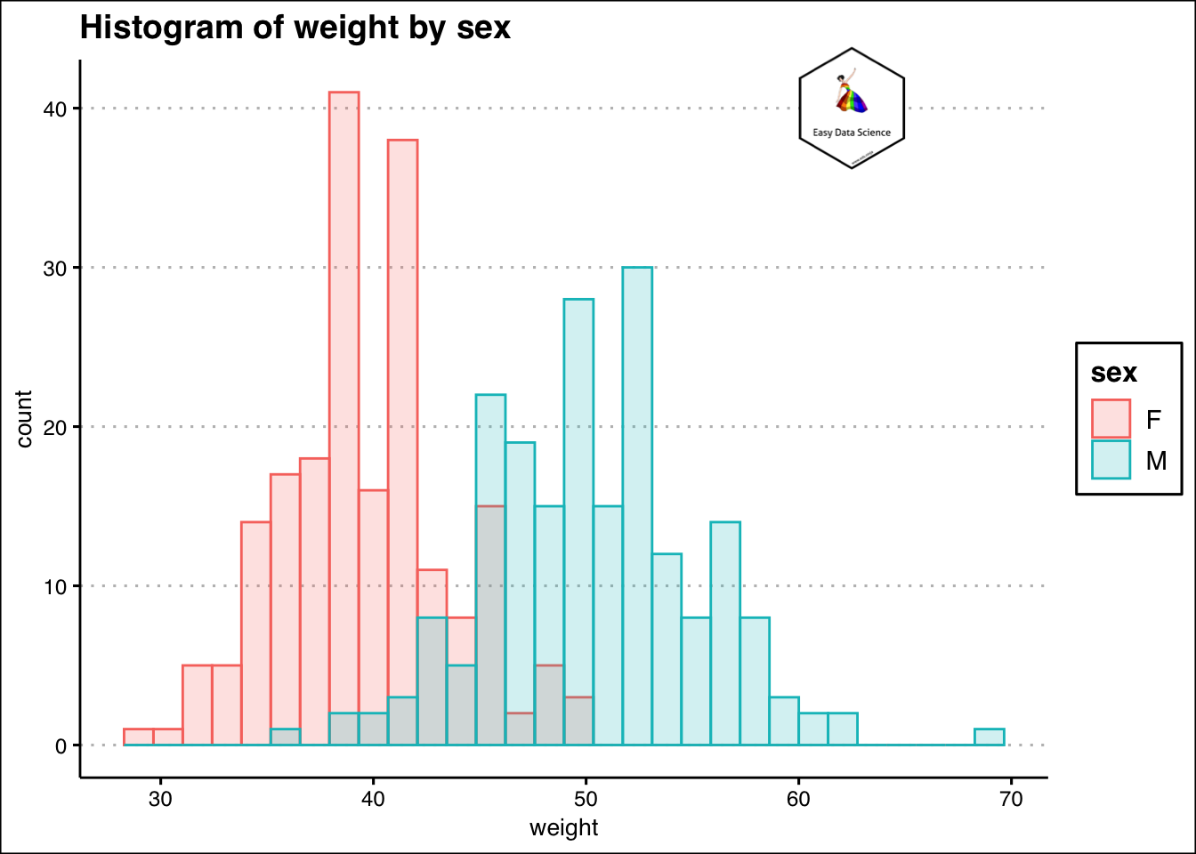
दो वेरिएबल
जब भी दो अंकीय वेरिएबल शामिल होते हैं, हम उनके बीच के संबंध को समझने की कोशिश करते हैं।
mtcars%>%
  ggplot(aes(x=mpg,y=hp))+geom_point(aes(colour=hp))+
  labs(x="Fuel consumption (Miles per gallon)",
       y="Engine power (HP)",
       title = "Relationship between Engine power and fuel consumption"
       )+
  theme_clean()+
  annotation_custom(l, xmin = 30, xmax = 35, ymin = 275, ymax = 350) +
  coord_cartesian(clip = "off")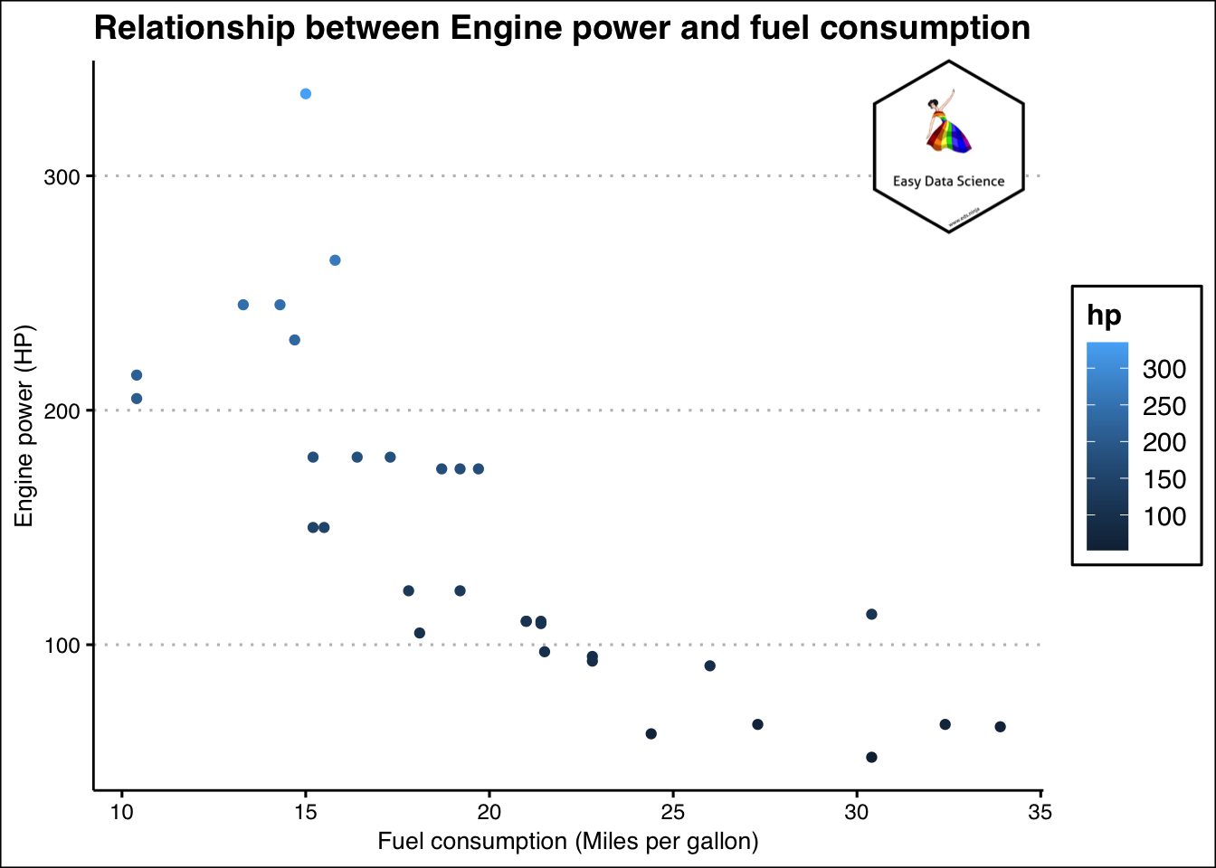
और यदि इनमे से कोई एक वेरिएबल दिनांक/वर्ष/माह/समय या समान होता है, तो हम प्रवृत्ति(trend) को समझने का प्रयास करते हैं।
x = WDI(indicator='SL.UEM.TOTL.ZS', country=c('IN'))
x %>%
  filter(is.na(x$SL.UEM.TOTL.ZS))
## iso2c country SL.UEM.TOTL.ZS year
## 1 IN India NA 1990
## 2 IN India NA 1989
## 3 IN India NA 1988
## 4 IN India NA 1987
## 5 IN India NA 1986
## 6 IN India NA 1985
## 7 IN India NA 1984
## 8 IN India NA 1983
## 9 IN India NA 1982
## 10 IN India NA 1981
## 11 IN India NA 1980
## 12 IN India NA 1979
## 13 IN India NA 1978
## 14 IN India NA 1977
## 15 IN India NA 1976
## 16 IN India NA 1975
## 17 IN India NA 1974
## 18 IN India NA 1973
## 19 IN India NA 1972
## 20 IN India NA 1971
## 21 IN India NA 1970
## 22 IN India NA 1969
## 23 IN India NA 1968
## 24 IN India NA 1967
## 25 IN India NA 1966
## 26 IN India NA 1965
## 27 IN India NA 1964
## 28 IN India NA 1963
## 29 IN India NA 1962
## 30 IN India NA 1961
## 31 IN India NA 1960x<-na.omit(x)
x$year<-lubridate::ymd(x$year, truncated = 2L)
x%>%
ggplot(aes(x=year, y=SL.UEM.TOTL.ZS))+
geom_line()+
geom_point()+
labs(x="Year",
y="Unemployment Rate (% of labour force)",
title = "Uemployment Rate by year in India",
caption = "Source: World Bank")+
theme_clean() +
annotation_custom(l, xmin = 1995, xmax = 2000, ymin = 6.5, ymax = 7.0) +
coord_cartesian(clip = "off")
आप चाहें तो बेहतर समझने के लिए निचे दिए गए वीडियो को देख सकते हैं |